Nintendo Game Boy's Target audience is Young Teens, specifically male.
As my game is for Nintendo Game Boy, I need to follow the same target audience.
I am targeting the average male teenager by
Making my game:
Fun
Strategic
Interactive [makes the player think]
Action filled
Quick and easy to learn [Important. if the player doesnt like the game in the first 5-10 minutes of playing, they ar elikely to not want to progress further.]
Using the images in Post Eleven, I measured out the base shape for the Front, back, and side graphics for the box's art. To the left is the box art for "Legend of Zelda: Link's Awakening" and on the right is my own box art for my game, "Robots vs. Humans". Please click the images to see them in large.
The ways I have followed conventions are:
Top and Centered logo
Age rating, company logo's in similar locations
Background images on both front and back
"GAME BOY" to the left of front, and on the side of the box
Back of box has logo top left
Two Screenshots to the right of the back of box
Description on back of box making the consumer desire to buy and play the game.
Barcode bottom left of back.
And the ways I opposed conventions are:
Official nintendo seal is only displayed on the front, as the consumer only needs to see it once.
Company logo is on the back, adding emphasis on who made it.
This piece of box art is what I would rate as what NOT to do.
There is very basic graphics, which is just plain flat colours, logo, and text. The back does feature the screenshots but at first glance the front coevr doesn't reveal that much about what it is.
This is much better, with a bold logo, consistent colour scheme, and clean layout.
The background isnt just a flat colour either, but rather has a 'watermarked' type image resembling something from the game.
Front cover:
Good; because it's using vibrant colours and relates to the game.
Back of box:
Bad; because it's solid colour, mostly text making you not wish to read it.
This box is included to show dramatic use of high contrasting colours;
It also uses a different layout for the company logo's, being top right then along the left side, as opposed to just at the bottom.
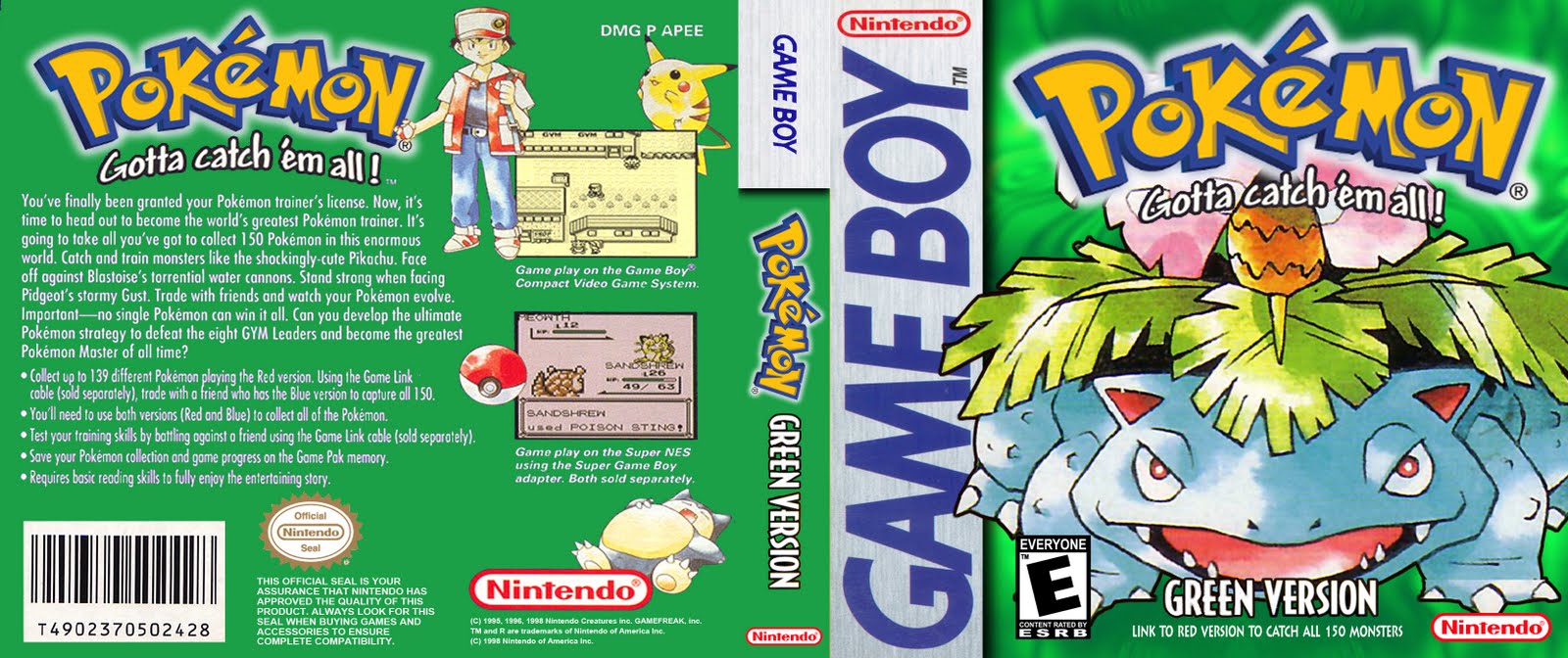
This and the other 3 Pokemon boxes all tick the right boxes.
The said boxes are:
- Fluent colour schemes
- Official looking
- Iconic figure consuming large proportion of image
The above two videos are game play representations of commercial products (Super Mario World 2: 6 Golden Coins) that have done what I want to do with the movement system in my game.
Features to note are:
- Platform based
- Powerups
- Secret areas
- Enemies
- "Over world" - the level selection system.
The following images may be hard to read and/or understand, click on them for a larger view.
Left is a two page spread advert for the Game Boy / Accessories which utilises iconic characters from video games on the same console by featuring them in a humerous comic strip.
This advert is a strike of genius and challenges conventions. It uses just one iconic figure, 5 words of text and 1 logo and you know exactly what it's for. A Pokemon Game Guide (A book that guides you through the game).
Using a phrase that people have ehard before it adds to the way the advert attracts the audiences' attention; and it's a very boldly said statement ad it uses a high contrast colour scheme of Yellow / White on Black.
Note: The lesser desired notices, such as copyright, are written very small and out of the way.
This advert follows a common scheme:
- Logo at top
- Address target audience
- Describes product/promotion
- Recognizable character/figure/photo
- Required Response (How the audience should react, here it tells them to visit a website)
- Extra imagery
- Notices and extra's, often noted with a asterisk (*) next to what the note is about.
This advert may be japanese, but it's here to highlight the importance of good graphics and/or recognizable imagery (here, a character in the game this is advertising is displayed, and a screenshot from the game itself)
Another type of advert for a game when in a magazine is if it's on the front cover of the magazine, like the image of "Nintendo Power" does to the left.
The main article and background image are about what the Pokemon franchise's next game plans are as theyre in early development.
With this image I designed it using mainly materials from previous posts, being the robot shown, and the plans for the main Box art.
I drew this draft in Adobe Fireworks CS3 and drew it to scale with an A4 sheet of paper (210mm in width, 297mm in height), which is the typical size for a magazine full-page advert.
This advert will use the coloured logo of Dragonfly Developments, and will keep whatever colour is already on the box art; but the rest shall remain greyscale, partially challenging conventions.


 This piece of box art is what I would rate as what NOT to do.