 This piece of box art is what I would rate as what NOT to do.
There is very basic graphics, which is just plain flat colours, logo, and text. The back does feature the screenshots but at first glance the front coevr doesn't reveal that much about what it is.

The background isnt just a flat colour either, but rather has a 'watermarked' type image resembling something from the game.

Good; because it's using vibrant colours and relates to the game.
Back of box:
Bad; because it's solid colour, mostly text making you not wish to read it.

This box is included to show dramatic use of high contrasting colours;
It also uses a different layout for the company logo's, being top right then along the left side, as opposed to just at the bottom.
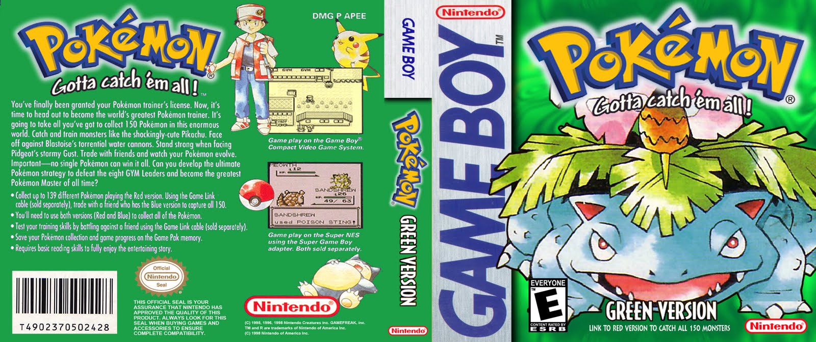
This and the other 3 Pokemon boxes all tick the right boxes.
The said boxes are:
- Fluent colour schemes
- Official looking

- Logo at top
- ESRB Rating bottom left

- Nintendo Seal of Approval on back
- Description on back
- Screenshots on back

- Consistency with products in the same series
- Logo on back
No comments:
Post a Comment