Nintendo Game Boy's Target audience is Young Teens, specifically male.
As my game is for Nintendo Game Boy, I need to follow the same target audience.
I am targeting the average male teenager by
Making my game:
Fun
Strategic
Interactive [makes the player think]
Action filled
Quick and easy to learn [Important. if the player doesnt like the game in the first 5-10 minutes of playing, they ar elikely to not want to progress further.]
Using the images in Post Eleven, I measured out the base shape for the Front, back, and side graphics for the box's art. To the left is the box art for "Legend of Zelda: Link's Awakening" and on the right is my own box art for my game, "Robots vs. Humans". Please click the images to see them in large.
The ways I have followed conventions are:
Top and Centered logo
Age rating, company logo's in similar locations
Background images on both front and back
"GAME BOY" to the left of front, and on the side of the box
Back of box has logo top left
Two Screenshots to the right of the back of box
Description on back of box making the consumer desire to buy and play the game.
Barcode bottom left of back.
And the ways I opposed conventions are:
Official nintendo seal is only displayed on the front, as the consumer only needs to see it once.
Company logo is on the back, adding emphasis on who made it.
This piece of box art is what I would rate as what NOT to do.
There is very basic graphics, which is just plain flat colours, logo, and text. The back does feature the screenshots but at first glance the front coevr doesn't reveal that much about what it is.
This is much better, with a bold logo, consistent colour scheme, and clean layout.
The background isnt just a flat colour either, but rather has a 'watermarked' type image resembling something from the game.
Front cover:
Good; because it's using vibrant colours and relates to the game.
Back of box:
Bad; because it's solid colour, mostly text making you not wish to read it.
This box is included to show dramatic use of high contrasting colours;
It also uses a different layout for the company logo's, being top right then along the left side, as opposed to just at the bottom.
This and the other 3 Pokemon boxes all tick the right boxes.
The said boxes are:
- Fluent colour schemes
- Official looking
- Iconic figure consuming large proportion of image
The above two videos are game play representations of commercial products (Super Mario World 2: 6 Golden Coins) that have done what I want to do with the movement system in my game.
Features to note are:
- Platform based
- Powerups
- Secret areas
- Enemies
- "Over world" - the level selection system.
The following images may be hard to read and/or understand, click on them for a larger view.
Left is a two page spread advert for the Game Boy / Accessories which utilises iconic characters from video games on the same console by featuring them in a humerous comic strip.
This advert is a strike of genius and challenges conventions. It uses just one iconic figure, 5 words of text and 1 logo and you know exactly what it's for. A Pokemon Game Guide (A book that guides you through the game).
Using a phrase that people have ehard before it adds to the way the advert attracts the audiences' attention; and it's a very boldly said statement ad it uses a high contrast colour scheme of Yellow / White on Black.
Note: The lesser desired notices, such as copyright, are written very small and out of the way.
This advert follows a common scheme:
- Logo at top
- Address target audience
- Describes product/promotion
- Recognizable character/figure/photo
- Required Response (How the audience should react, here it tells them to visit a website)
- Extra imagery
- Notices and extra's, often noted with a asterisk (*) next to what the note is about.
This advert may be japanese, but it's here to highlight the importance of good graphics and/or recognizable imagery (here, a character in the game this is advertising is displayed, and a screenshot from the game itself)
Another type of advert for a game when in a magazine is if it's on the front cover of the magazine, like the image of "Nintendo Power" does to the left.
The main article and background image are about what the Pokemon franchise's next game plans are as theyre in early development.
With this image I designed it using mainly materials from previous posts, being the robot shown, and the plans for the main Box art.
I drew this draft in Adobe Fireworks CS3 and drew it to scale with an A4 sheet of paper (210mm in width, 297mm in height), which is the typical size for a magazine full-page advert.
This advert will use the coloured logo of Dragonfly Developments, and will keep whatever colour is already on the box art; but the rest shall remain greyscale, partially challenging conventions.
Ancillary task one - Design the cover for the games' package.
To start I have made a rough draft which details placement of parts of the box, image shown to the side. Note: branding at base, game's title at top, official game boy logo to the side, nintendo seal bottom left.
So far I have spent a [b]very[/b] large amount of my time, at least 30+ hours, into developing this game.
I feel I have all the key requirements of the game working:
[Fully functional] Loading Bar
[Fully functional] Branding at start (animation)
[Fully functional] Title screen / Logo
[Fully functional] Statistic system programmed
[Fully functional] Movement system programmed
[Mostly functional] Battle system programmed
[Fully functional] Co-ordinated system in the movement for respawning and replacement after battles
[Fully functional] Vertical moving platforms in the game.
[Fully functional] Music and sound effects (sourced from a royalty free sound CD, and a royalty free CD with 600+ 'chiptune' music pieces.)
And to end this post, a link to a playable demo of the game. It contains 1 enemy, half a level, 2 pieces of music and mostly completed programming.
------------ ------------
(Above link takes you to "http://rvh.comule.com/2.html")
NOTE: I would have posted the game directly onto this site, but due to the game being stored in two separate files (Data&Graphics // Sound) I cannot post it here, as they need to be in the same directory as eachother, and Blogspot doesn't allow access to this.
Recently an idea came to mind, which was to go against conventions of an RPG game with the walking system in the game I will be creating. Instead of the omniscient perspective overworld view that I've previously mentioned in Post Two, I will make a side-scrolling platformer style movement system instead, effectively merging Super Mario with Pokémon, where when touching an enemy you can't kill it or die from it, but rather enter a battle with it.
Below I will analyse parts of super mario:
Here is the box art for Super Mario Land 2: 6 Golden Coins.
Key features to note with this image are:
- Cartoon graphics
- Platinum "GAME BOY" logo to the left, combined with platinum nintendo seal. This show this game is very popular and has sold over a million copies.
- Age rating says "K-A" or, Kids to adults (all ages)
- Bright, colourfulimage
- Focus of image is on main character of the game.
Next is the back of the box art, which displays:
- Logo at the top
- Screenshots to the side
- Text Dscription of game in various languages
- Logos of developing companies at base of the case
However, I feel this part of the box art is a terrible example of the game. It's very boring, and very un-proffesinal looking; note the bright solid red background, and the simplicity of it all - looks like a young teen/child made this in ten minutes.
To the right is the games' title screen. It's good because:
- It brings a lot of focus onto the games' logo
- Very stylized, with the cartoony and bold appearance, with the mushrooms at the base, stars behind the logo and the main focus being a simplistic sign
- Says at base of sign "(C) 1992 Nintendo" - this shows 2 main pieces of information some people may be interested in - Who made it, and when.
It also has some bad sides:
- It isn't animated at all, and also has no music with it... this doesn't immediately stimulate the player.
- Nowhere does it say "Press A to continue" or anything of the sort, but rather it assumes the player will know what to do.
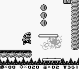
Here's the main thing I am referencing from Mario - the gameplay:
Some key features to mention are:
- The way it's easy to differentiate from the background and foreground
- Easy to make 'collectibles' such as money or bonus items
- Player can actually be hurt from the surroundings, as opposed to just in battles
- Game immerses the player a lot more than senselessly walking long distances with little interactivity
- Allows player to choose how the game is played - You can avoid fighting monsters, if your low on health, or you can run in and fight everything you can/want.
This last screenshot shows exactly what I wanted to display in terms of:
- An enemy is avaliable to battle on the screen, a small jump away
- The enemy can attack you outside of battle, making it worthwhile the players' time to kill it, so it can't bother you any more.
- Player HUD (heads up display) featuring Lives left, Money, Enemies killed and Time remaining. I shouldn't need lives or time, but this will be modified when I make it.
- Again, evident difference from the background and the foreground - it's more than obvious what you can walk on.
I am obtaining materials to use as a reference point and also as research into similar products. This will help me find out how real companies brand thier products, and how the games are meant to appear and be played.
Note I am choosing all Game Boy platform games, as I intend to go for the retro 'pixelated' look, and these games are perfect for the job.
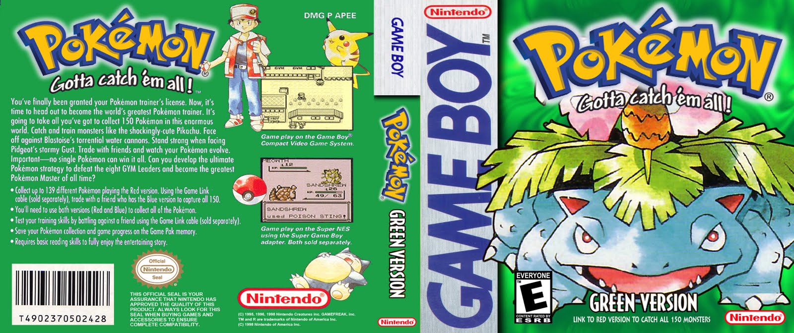
First on the list, are the pokémon games. These will be my main reference point.
Here, I have the original box art for the first two games, which were released together. Key features are:
- Pokémon Red has a Red appearance to it
- Pokémon Blue has a Blue appearance to it
- Both games feature logo at top, company logo at base of box, and game's age rating to the bottom left.
- Left fifth of box art displays the game's platform, being the Nintendo Game Boy
Here, is the game's battle system.
Key features to note are:
- Commands bottom right
- Both players have health and level values
- Top right is opponent, looking at bottom left
- Bottom left if the player, looking top right
- Player sprite in bottom left's pixels are at 2x size
And finally, from the pokémon games is the 'overworld' system. Key features here are:
- Simplistic cartoon graphics
- Pixelated look
- Viewed from a omniscient perspective
- Character speech dialogues
- Tile based movement
- Walls, Colision detection
Next on the list is a game in the Final Fantasy Series, Final Fantasy VI (Six).
To the right is the box art, and I chose to feature this due to being much more simplistic. Key features:
- Logo is centered
- Only the logo is in colour
- Background uses a 'sketched' style or art
- Like the Pokémon games, base of box features the company logos
- Bottom left again features the age rating
- Game's platform fills the left fifth of the art, this time Game Boy Advance
Here I have Final Fantasy VI's battle system. The key features are:
- Four character gameplay
- Character 'classes'; meaning each character can do thier own skills
- Colour graphics: this is not what I intend to match, but this is here for reference purposes nonetheless.
- Open battlefeild, where players arent locked at one angle in one place.
Finally, to the left is Final Fantasy Tactics Advance, which is a port of the Playstation game Final Fantasy Tactics to the Game Boy Advance. Key features of the Box art:
- Crisp, colourful graphics center lower on box
- Logo near top, same style as other games in the same series
- Company logos at base of box again
- Age rating at base of box, but it is to the right, not the left.
- Again, the left fifth of the art is covered by the game's platform, being as previously mentioned, Game Boy Advance
This is the battle system in this game. Differences here are that it is a tactical game based heavily on position in the map, and is liek chess combined with Final Fantasy VI. Key features:
- Isometric Graphics - the angle in which the graphics are drawn. makes the game appear 3D when it isn't.
- Pixelated look
- Health and commands at bottom of page, like all other games previously mentioned.
Now that I've analysed imagery from 3 games, here is some footage of Pokémon. I will note below each clip what I like and what I can use in my own work.
Above is the intro clip.
- Branding: Look at Game Freak title.
- Throw you in the game, show in a short period of time what the game is about.
- Sound effects based on the motions you see in the clips
Above is a video showing off the Battle System.
- Commands bottom left
- Animations
- Computer retaliates with their own decisions.
- A 'Console' bottom left, describes what just happened in a simplistic way to make the game more user-friendly
Above we see the player walking around and showing the transition from overworld view to battling.
- omniscient perspective overworld view
- Pixelly Graphics
- Stylised characters
- Interact with people around you
- Tile based walking ('square movements' - where you can only go on the set 'squares' avaliable.
Overall, I feel I shall attempt to mimic the retro feel of the game, and the same type of gameplay by putting the following features in my game:
- Turn based battle system
- Using the same style music / sounds (Chiptune / 8-bit)
- Making the graphics both greyscale and have a pixel-perfect look about them
- Overworld view level/maps.
- Tile based movement
So; to begin this blog, and my work, I'm going to need to state what I'm actually doing, and how I'm going to do this. After looking at the optional specifications, I chose option 11, Video / Computer Game.
I instantly thought about what platform this is going to be in, and what the game itself is going to be; and I decided the game shall be an RPG game, much like the games Pokémon and Final Fantasy, and I will program and design it in the Adobe Flash platform, with the combination of additional graphical work in Adobe Fireworks as I understand how to do a fair amount in both of these applications.
I will detail more about the game itself at a later time after researching already existing games, and having longer to think about it.
With option 11, I have to choose two of three ancillary tasks, and below are the two I chose:
Design the cover for the games' packaging.
Design a magazine advertisement for the game.
I will do these after a large part of my primary task is completed. My primary task is to design the first level of a new computer/video game... My project being an RPG game typically doesn't have 'levels' or 'stages', So I will just create the first section of game-play.


 This piece of box art is what I would rate as what NOT to do.


 #11 - Video/Computer Game
 ------------